Helping an organisation create a B2B cloud powerhouse – Better Known


Helping an organisation create a B2B cloud powerhouse
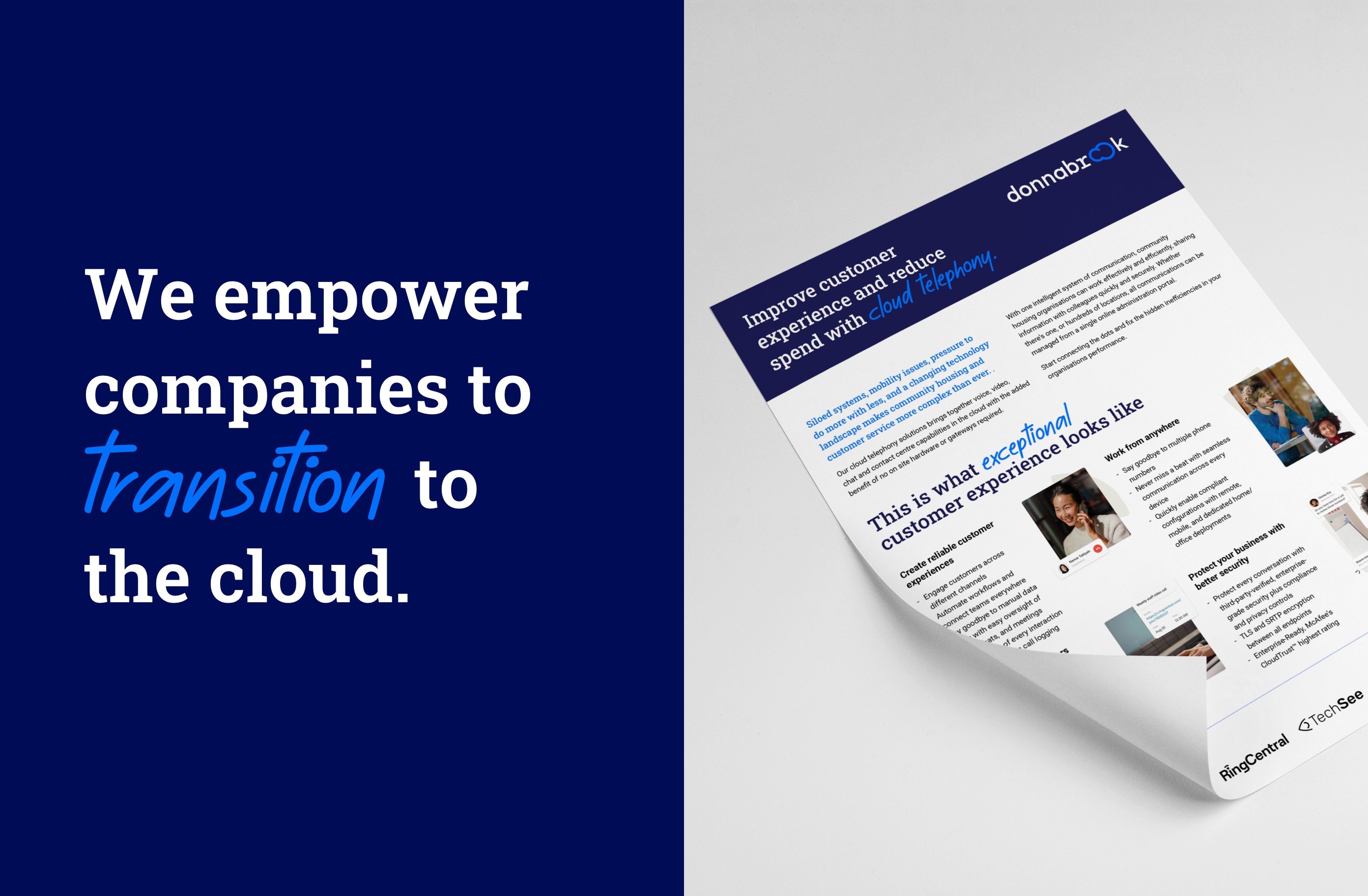
Donnabrook empowers companies to transition to the cloud for unified communications. As a strategic cloud partner and trusted advisor, they help businesses improve and transform their customer experience and perform at levels they never thought possible.
Two years into the story, Donnabrook had a problem – their brand didn’t match the company's magic. It was lacklustre and did little to explain the value they provide.
Brand strategy
We defined the business as one that believes in the power of the cloud, understands how cloud technology provides business value, and is motivated to help businesses significantly improve customer experience. The end goal for customers is a completely integrated business communication system that can do more, with the help and support from Donnabrook.
To match this vision, the new brand needed to be bold, discerning, and instantly recognisable.
Inspired by Donnabrook’s brand values, we set about creating a brand platform that would inspire action, by making a positive impact and delivering a consistent brand experience.
Our brand strategy focused on the customer experience proposition whilst using tangible benefits that the cloud can provide. Underpinned by their expertise and knowledge, we positioned Donnabrook as a cloud partner which is switched on to the needs of today’s customers. By helping to transform the tech stack, Donnabrook embeds advanced technology to change customer service and employee experience for the better.


This is a great example of a completely turning an approach it on its head to deliver something better for customers.
Brand identity
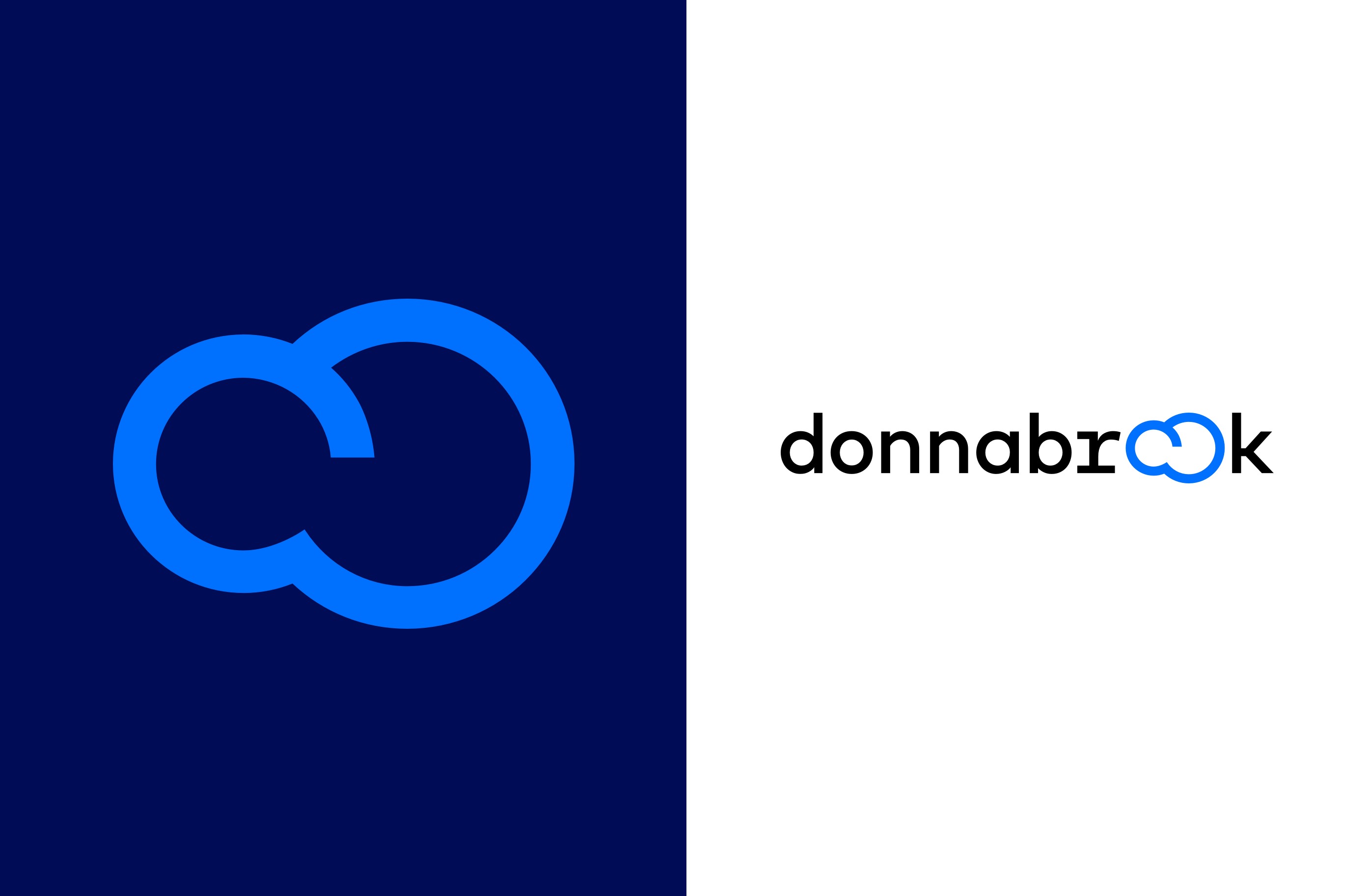
The logo is a nod to the cloud and its simplicity is indicative of getting customers started on their cloud journey as effortlessly as possible.
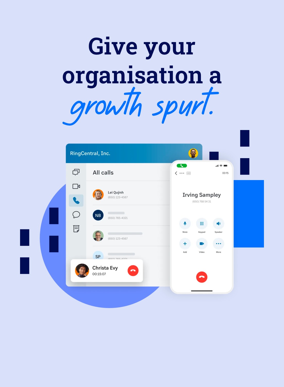
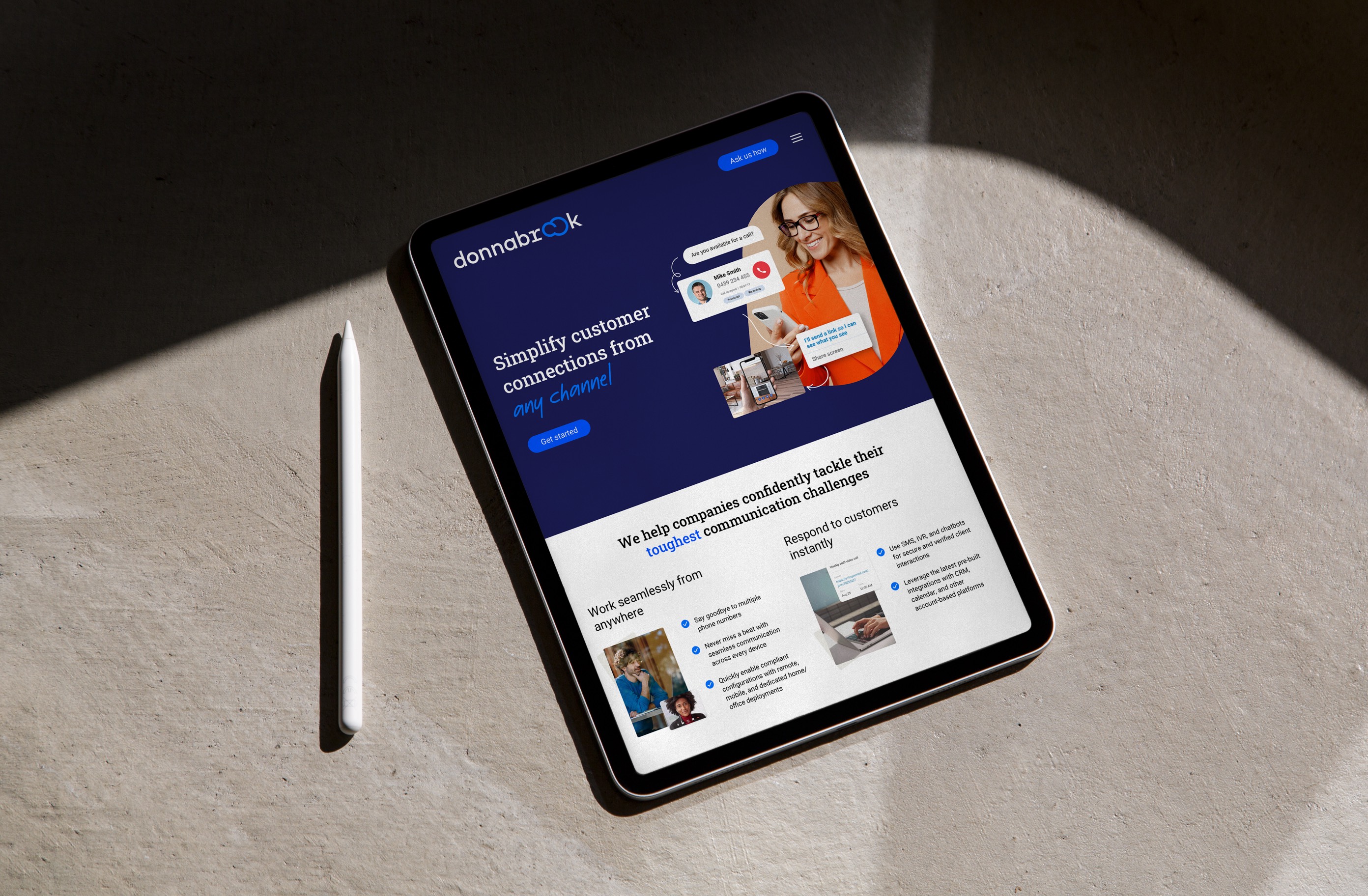
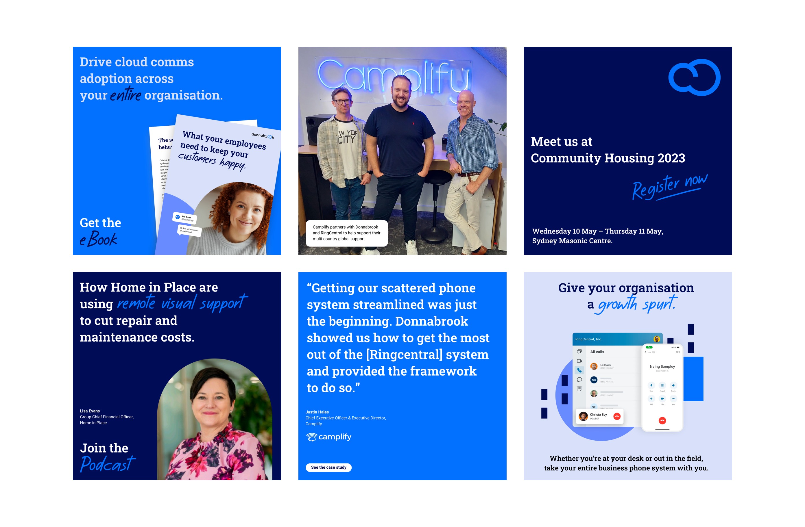
The rest of the identity heavily promotes the product benefits. Its clean cut and the entire graphic language creates a unified visual identity focused on simply and connectivity.
Familiar with the existing core customer base, the colour palette was evolved and elevated, with bright blues chosen to brighten and simplify digital experiences. Meanwhile, the brand language disposes of jargon to communicate in an easy and expert way, making customers feel informed.
