A holistic website redesign for better user engagement – Better Known


Research and user experience
Our process started with an in-depth content audit and high-fidelity wireframes. These steps helped us refine page goals, content structure, storytelling, and the overall customer journey before moving into UI design.
Recognising that SEO was driving significant traffic to key pages, we prioritised maintaining and enhancing SEO performance as a critical element of the redesign.
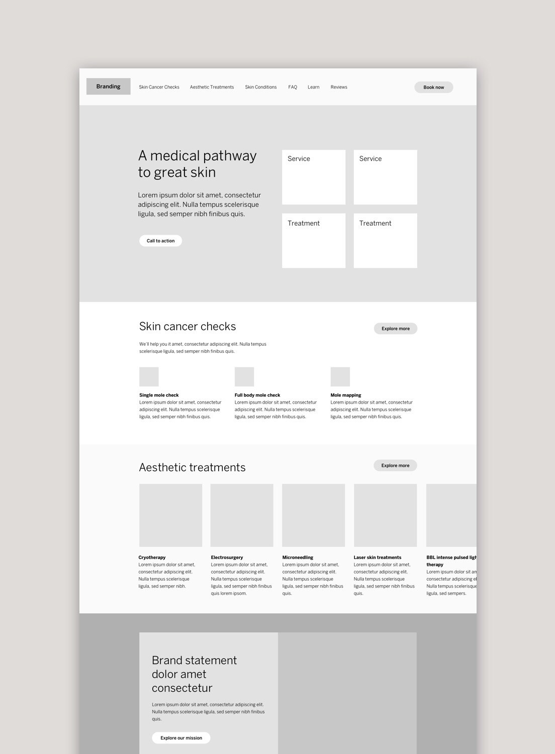
Defining the website architecture
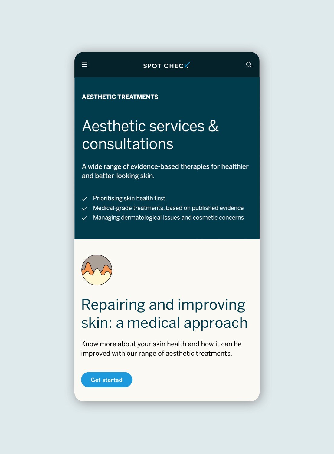
For Spot Check, we re-architected the entire site to build a stronger connection between the scientific information on medical conditions, the treatments available and the expert practitioners that perform the treatments.
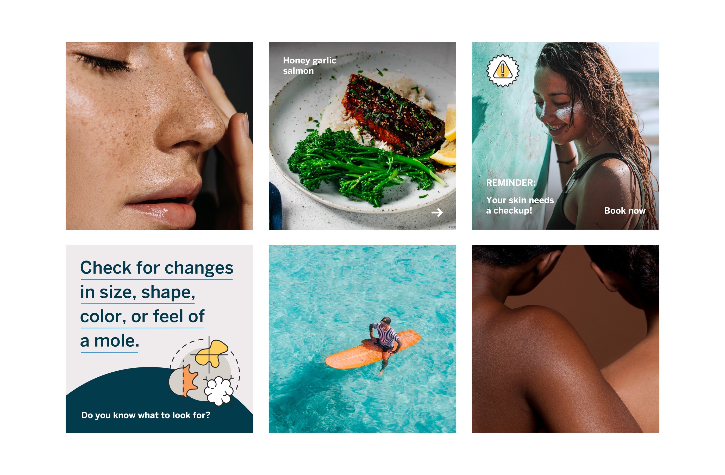
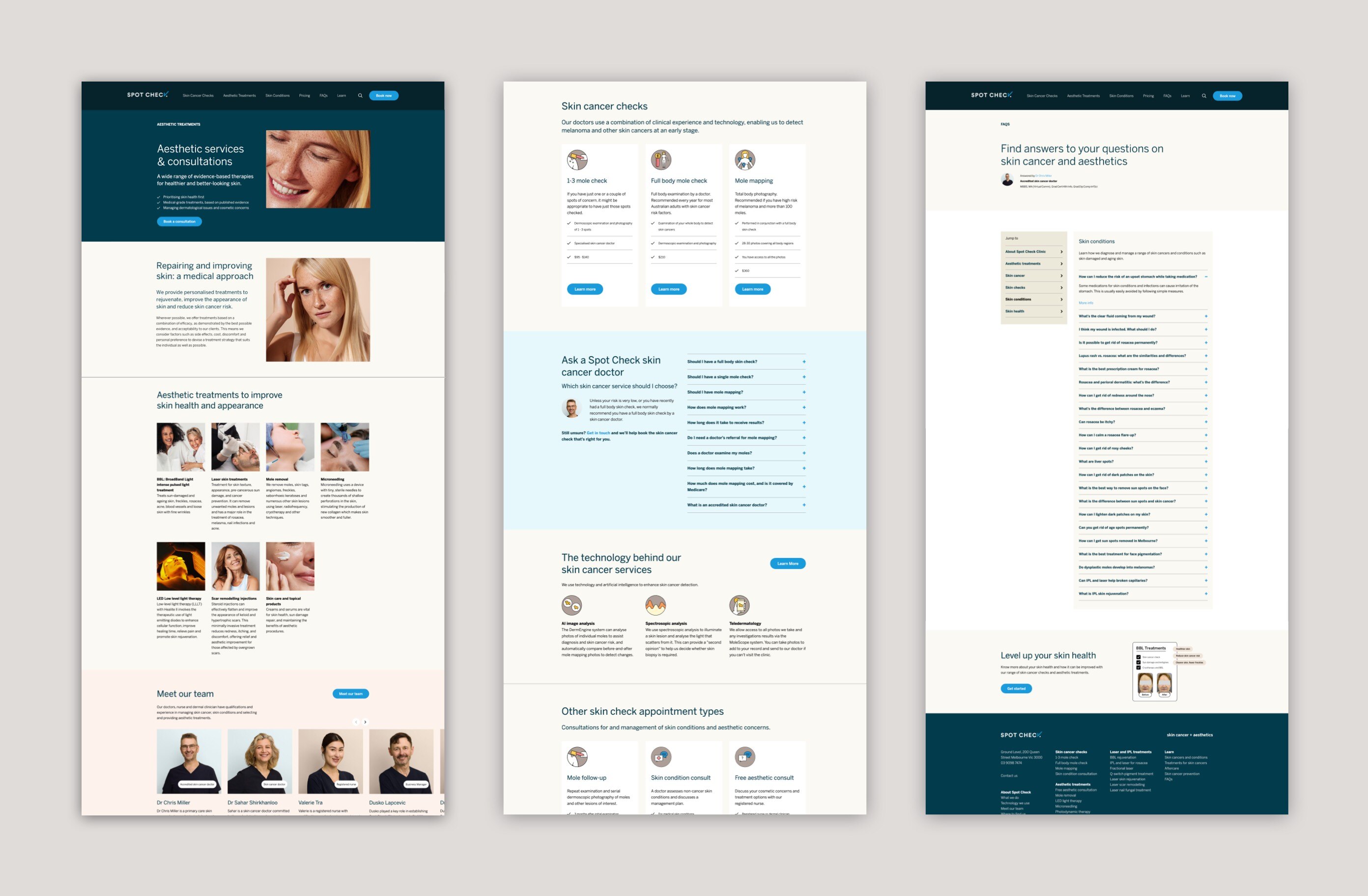
UI designs then began to solve the problem of how to communicate that information visually. We brought the brand to life using new photography and messaging and worked to position Spot Check as a more holistic provider of skin health treatments.
A key design involved the main navigation and footer, key areas that not only create a cohesive experience for users but also enable users to navigate hundreds of pages of content.
A modular template system was created to enable better flexibility in the backend and higher engagement for users exploring long pages of content.


We are beyond happy with the excellent work Better Known did to redevelop our extremely large, complicated and confusing website. They went to great effort to understand our business to develop an identity and brand strategy that set us apart from our competition.
Website design
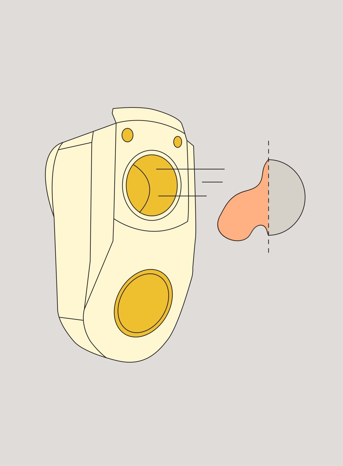
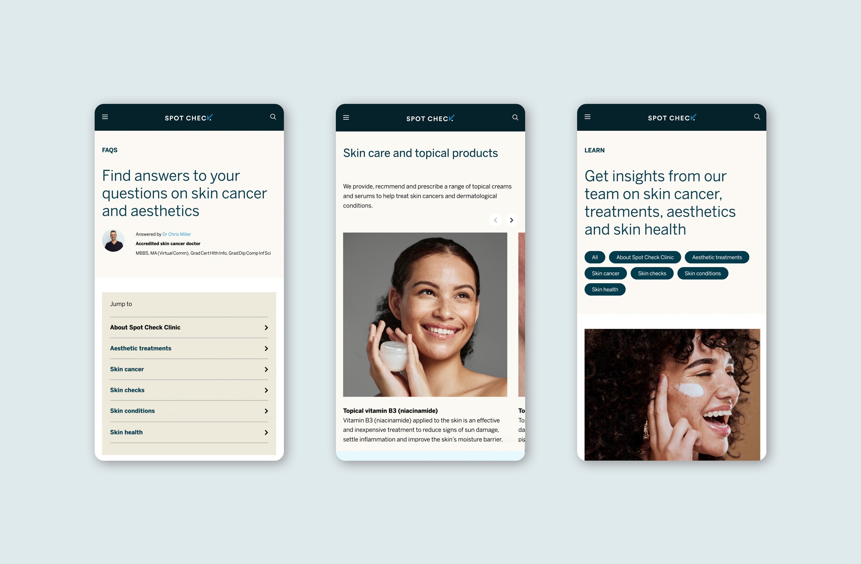
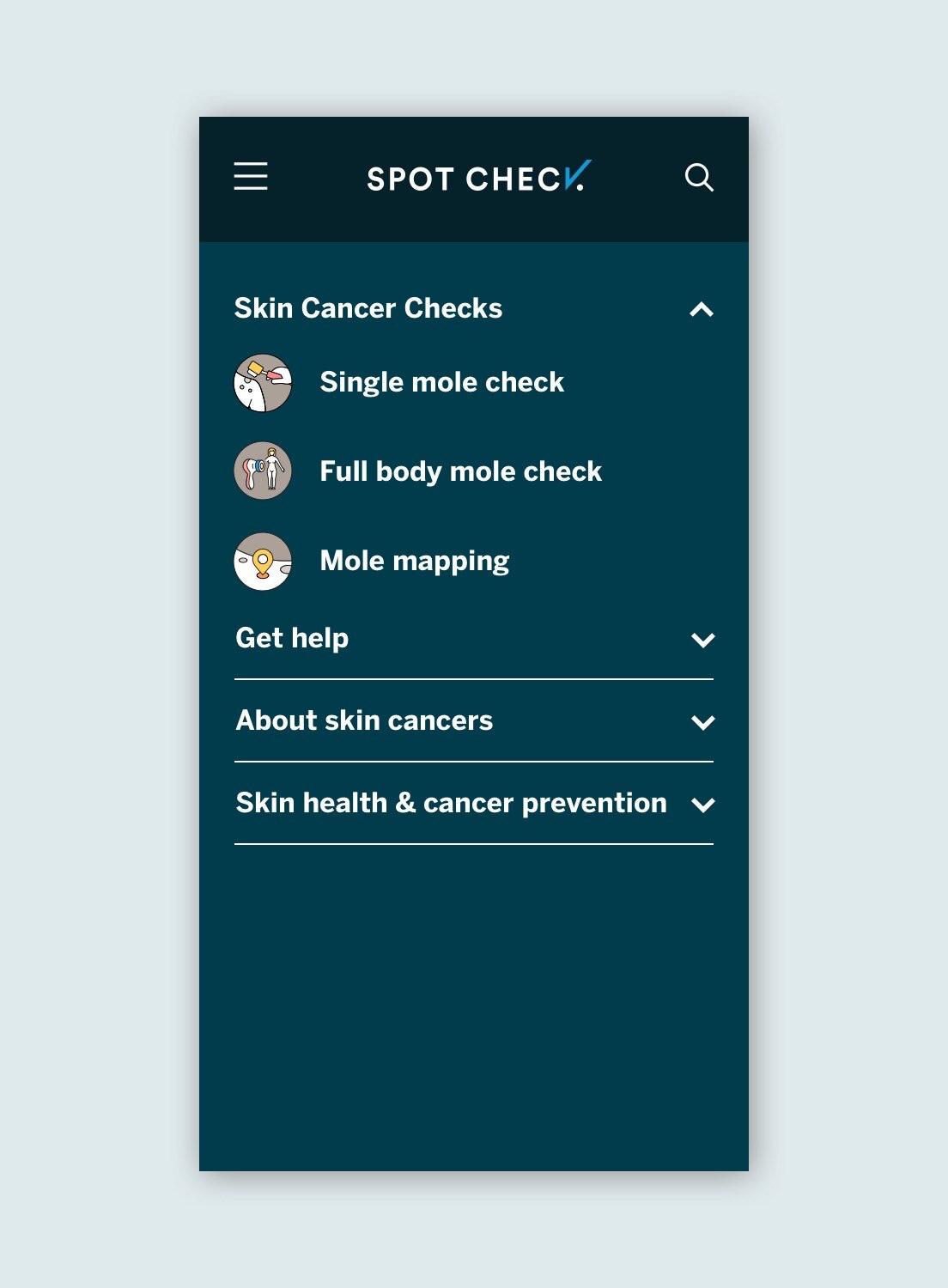
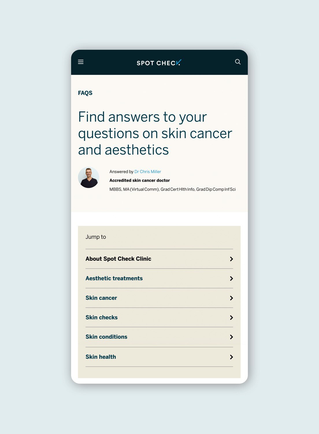
A suite of icons were developed to provide a friendly, open feel to direct users to key content, while landing pages direct users to specific, deeper content. Previously unordered blog pages were re-tagged into one new section, and the FAQs content was neatly housed in accordion-style slide-outs.
The website re-design has resulted in strong user growth with an average of 60K active users per month (up 20% on average).
"The team constructed a content management system and information architecture to wrangle hundreds of pieces of content in a way that makes it logical and easy to discover."
Dr Chris Miller, Founder – Spot Check